
Making GitHub Contributions Visible — Bringing Your Open Source Activity to Life on Your Portfolio

I used to have a static list of open source projects on my portfolio. The list was fine, I suppose — names, descriptions, a link to GitHub. But every time a recruiter visited, I wondered what they actually saw. Did they click through? Did they check my GitHub? Or did they assume the list was outdated, that those projects were dusty relics from three years ago?
Then one day I was scrolling through a designer's portfolio and saw their GitHub contribution graph embedded live, pulsing gently when they'd had good days. Something clicked. Not just aesthetically — but strategically. A contribution graph shows commitment. It shows consistency. It shows you didn't just write code once and disappear.
That's when I decided to build it properly for my own portfolio.
Why a contribution graph matters
Here's the uncomfortable truth: most people won't click through to your GitHub. They might glance at it, but if you're trying to show the breadth and depth of your open source work, a flat list doesn't cut it.
A graph does. It answers questions without requiring explanation:
- Are you active right now, or was this a sprint three years ago?
- Do you contribute consistently, or in bursts?
- How serious are you about this?
When I put mine on my Open Source page, I wasn't trying to be flashy. I was trying to be honest. To say: "Here's the work I do. Here's when I do it. Here's how much. Click on any day and you'll see exactly what happened."
The architecture
I approached this in three parts:
1. Fetching the data — GitHub's GraphQL API 2. Rendering the visualization — React component with custom styling 3. Making it interactive — Tooltips, animations, and direct links to GitHub
Fetching contributions via GraphQL
GitHub's REST API can't give you the granular contribution data you need. You need GraphQL. Here's the core query I use:
query($login: String!, $from: DateTime!, $to: DateTime!) {
  user(login: $login) {
    login
    avatarUrl(size: 96)
    contributionsCollection(from: $from, to: $to) {
      contributionCalendar {
        totalContributions
        weeks {
          contributionDays {
            contributionCount
            contributionLevel
            date
          }
        }
      }
      commitContributionsByRepository(maxRepositories: 100) { ... }
      issueContributionsByRepository(maxRepositories: 100) { ... }
      pullRequestContributionsByRepository(maxRepositories: 100) { ... }
      pullRequestReviewContributionsByRepository(maxRepositories: 100) { ... }
    }
  }
}
The key insight: contributionLevel isn't just a count. It's a quartile — GitHub segments contributions into NONE, FIRST_QUARTILE, SECOND_QUARTILE, THIRD_QUARTILE, FOURTH_QUARTILE. This lets you bucket days into intensity buckets without knowing exact thresholds. (GitHub doesn't tell you the thresholds. It's part of their secret sauce.)
The second part of the query — fetching contributions by repository — lets me separate contributions to my own repos from external contributions. This is crucial. A day with 10 commits to my own project looks different from a day with 10 code reviews on someone else's project. Both matter. But they tell different stories.
export async function fetchContributionCalendarData(): Promise<ContributionCalendarData> {
  const now = new Date();
  const from = new Date(now);
  from.setFullYear(now.getFullYear() - 1);  // Last 12 months
  from.setDate(from.getDate() + 1);

  const raw = await fetchGitHubGraphQL(CONTRIBUTION_CALENDAR_QUERY, {
    login: GITHUB_USERNAME,
    from: from.toISOString(),
    to: now.toISOString(),
  });

  // Parse weeks into flat array of days
  const days = calendar.weeks.flatMap((week) =>
    week.contributionDays.map((day) => ({
      date: day.date,
      count: day.contributionCount,
      level: toContributionLevel(day.contributionLevel),
    }))
  );

  // Separate own vs external contributions
  const ownContributionCountsByDate = {};
  const externalContributionCountsByDate = {};

  // Accumulate counts from commits, issues, PRs, and reviews
  accumulateContributionCounts(
    collection?.commitContributionsByRepository,
    username,
    ownContributionCountsByDate,
    externalContributionCountsByDate
  );
  // ... repeat for issues, PRs, reviews
}
This runs once on build time, or on-demand if you're using ISR (Incremental Static Regeneration). I refresh hourly because a stale contribution graph defeats the purpose.
Visualizing the calendar
Once you have the data, rendering it is actually straightforward — it's just a grid. GitHub uses a 7-day week layout, and each day is a colored square. The color intensity corresponds to contribution intensity.
const GRASS_GREEN_SCALE = [
  "#dde5d8",  // No contributions
  "#bce3af",  // First quartile
  "#86d070",  // Second quartile
  "#43ad4d",  // Third quartile
  "#1f7a33",  // Fourth quartile
];

function colorForLevel(level: number): string {
  return GRASS_GREEN_SCALE[Math.min(level, 4)];
}
I render each day as a square with:
- Rounded corners (5px) for a softer look than GitHub's hard edges
- Hover scale (1.1x) so users know it's interactive
- Border (1px, subtle) to separate adjacent days
But here's where it gets interesting — the UI hints matter.
Making it tell a story: The pulsing indicator
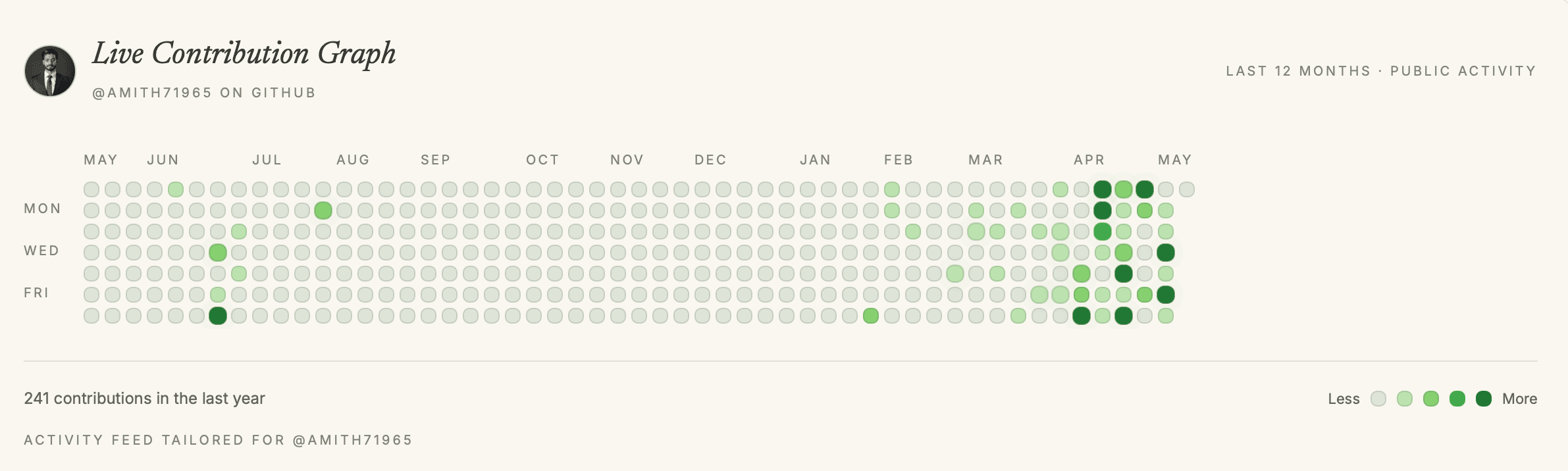
Not all days are equal. A day with 1 commit is different from a day with 15. But the color scale only has 5 levels. You lose information.
So I added a pulsing animation. Days that meet certain criteria pulse gently:
const shouldPulse =
  day.count > 0 &&
  (externalCount > 0 || inferredOwnCount >= 5);

const pulseQualifier =
  externalCount > 0
    ? " · external contribution"
    : inferredOwnCount >= 5
    ? " · own repo burst (incl. private)"
    : "";
The logic:
- If a day has external contributions (code reviews, issues on other repos), it pulses.
- If a day has a "burst" on my own projects (5+ commits), it pulses.
This is communicated in the tooltip. Hover over a pulsing square, and you learn: "12 contributions on Mar 24 · external contribution". That tells you why the day matters.
The pulse animation is CSS:
@keyframes contribution-block-pulse {
  0%, 100% {
    box-shadow: 0 0 0 0 rgba(26, 24, 21, 0.15);
  }
  50% {
    box-shadow: 0 0 0 8px rgba(26, 24, 21, 0);
  }
}

.contribution-block-pulse {
  animation: contribution-block-pulse 2s infinite;
}
Subtle. Not obnoxious. But it draws the eye to the days that matter most.
From graph to action: PR status tracking
A contribution graph is great, but it's passive. You're looking at data, not through it to action.
That's why I also built a PR feed below the graph. It fetches your recent pull requests — merged, open, closed — and shows them in reverse chronological order. Each PR card has:
- Title and repository
- State badge (merged: green, open: blue, closed: gray)
- Additions/deletions count (visual weight of the change)
- Click-through to GitHub for the full context
export async function fetchContributionPRs(): Promise<GitHubPR[]> {
  const allPRs = [];
  let cursor = null;

  for (let page = 0; page < 2; page++) {
    const data = await fetchGitHubGraphQL(PR_SEARCH_QUERY, {
      cursor: cursor ?? undefined,
    });

    const nodes = data.data?.search?.nodes ?? [];
    for (const node of nodes) {
      allPRs.push({
        title: node.title,
        url: node.url,
        state: node.state, // MERGED, OPEN, or CLOSED
        number: node.number,
        additions: node.additions,
        deletions: node.deletions,
        repository: { ... },
      });
    }

    if (!data.data?.search?.pageInfo?.hasNextPage) break;
    cursor = data.data.search.pageInfo.endCursor;
  }

  return allPRs;
}
Pagination is important here — you could have hundreds of PRs. I fetch up to 100 and stop. For most developers, that's the last 3–6 months of activity. That's enough to tell the story.
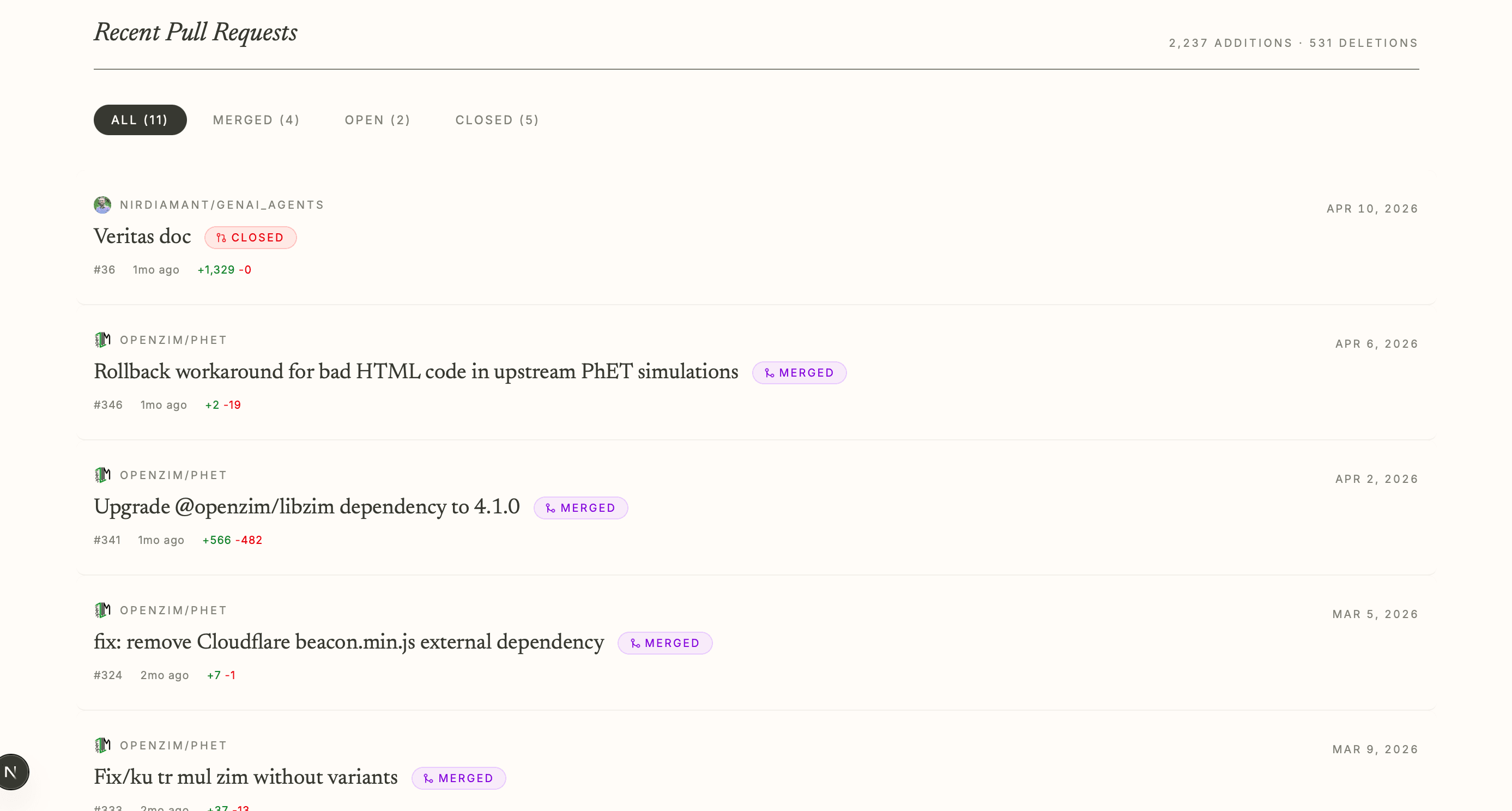
The PR feed makes the graph actionable. It answers: "What are you working on right now?" And it does it without requiring a click outside your portfolio.
The library: react-github-calendar
I didn't build this from scratch. I used react-github-calendar as a starting point.
Honest review: The library is clean and well-maintained, but it's also fairly opinionated. Out of the box, it renders a GitHub-style calendar with GitHub's exact colors and styling.
For my portfolio, that wasn't enough. I needed:
- Custom colors (to match my design system)
- Pulsing animations (not in the library)
- Separate tracking of own vs external contributions (not in the library)
- Tooltips (the library uses basic
titleattributes)
So I ended up forking the concept rather than using the library directly. I kept the data-fetching patterns but rewrote the rendering layer entirely. This gave me:
- Full control over styling and animation
- Radix UI for accessible tooltips
- Custom logic for distinguishing contribution types
- ISR caching at the Next.js level (not library-level)
This isn't a dig at the library — it's well-designed for general use. But portfolios are specific. You want to tell your story, not GitHub's story.
Why this matters for recruitment
Here's the thing nobody says out loud: a contribution graph changes how recruiters perceive your work.
A flat list says: "I've done these things."
A graph says: "I do this consistently. I'm engaged. I care."
When a recruiter sees a calendar that's actively being updated in real-time (or at least, hourly), they see someone who's active right now. Not someone coasting on old projects. Not someone who did a burst of work years ago and hasn't touched anything since.
It's a small thing. But it's the difference between "interesting" and "actively interesting."
Takeaways
If you're building a portfolio and want to showcase open source work, here's what I learned:
-
Data fidelity matters. Distinguish between personal and external contributions. The narrative is in the nuance.
-
Interaction is communication. A pulsing animation doesn't just look nice — it says "this day is important." A tooltip explains why. A direct link to GitHub says "I trust you to dig deeper."
-
Combine the view layers. A graph alone is passive. A PR feed alone is disconnected. Together, they tell a full story: "Here's my activity. Here's what I shipped."
-
Refresh the data. A static graph defeats the purpose. Mine refreshes hourly. Yours should too, at minimum daily.
-
Design from the recruiter's perspective. What do they need to know in 10 seconds? Your graph answers that. Everything else is detail for people who click through.
The contribution graph on my Open Source page isn't the flashiest thing I've built. But it's one of the most honest things. It's real data. It's real activity. And it updates every time I push a commit.
That's what a portfolio should be — not a museum of past work, but a living reflection of what you're doing right now.

Discussion (0)
Sign in to join the discussion.